Wee Introduction to Lith Printing
After 15 years as an avid lith printer, I'm trying to do my part to raise awareness of this, in my opinion, fascinating and unfairly unknown analog printing process.
I must admit that my first contact with lith printing didn't impress me at all. It was in a book by photographer Lee Frost, who photography aficionados of a certain age will surely be familiar with. When I saw them, they looked flat, lacking contrast, with ugly pink tones and greenish shadows. Funny how life turns out! Twenty years later, here I am, proselytizing.
Lith printing is a technique that defies perfection, embracing texture, grain, and the happy accident. One of the aspects that appeals to me most is the ability to interpret the same negative in multiple ways, simply by using different types of paper. With this article, I wanted to show this aspect of lith printing with a few examples. I used a negative from my project “Casa de Campo: Lo que no se ve (Unseen)”, taken with a point and shoot camera, the Sigma 28 AF Zoom with nocolorstudio n10 film.
On Agfa Brovira paper.
What is lith?
Lith printing uses a special developer composed of two parts, A and B, and traditional black and white printing paper. One of its main characteristics is the so-called "infectious" development, when shadows appear and begin to spread rapidly due to the paper's significant overexposure. This is the critical moment when we must decide the "snatch point," the moment at which we decide to remove the print from the developer, once the shadows acquire the desired density. The result is images with deep, generally harsh, and grainy shadows and smooth highlights and midtones, as well as warm tones on some papers, such as pinks and oranges, while other papers produce more subdued tones, such as sand and café au lait (that totally is a colour in Spanish). In this print, Bergger Prestige has produced beautiful warm tones and fairly smooth shadows.
Bergger Prestige.
Image contrast is controlled by overexposing the paper. If possible, you should determine the exposure time at which the light areas of the negative begin to show detail and use this as a basis for overexposing a minimum of 1.5, 2, or 3 stops. In lith printing the use of the enlarger's contrast filters is unnecessary. The developer is used very diluted, so development is slow, from a minimum of 4 minutes to achieve a true lith effect, up to 15, 20, or 30 minutes, or even longer, depending on the type of paper and, above all, the oxidation of the developer.
Kodak Art Elite gives a harsher texture.
By using different types of paper, we can produce images with a very different atmosphere from the same negative. Unfortunately, not all photographic papers work with this process, and currently only two are produced: Fomatone Classic and Foma Retrobrom. This makes the use of vintage papers almost a necessity, and although it's the aspect that most appeals to me about lith printing, it's true that it's becoming increasingly difficult to find old papers. Packs of Kodak, Agfa, and other completely forgotten brands like Tura or Argenta from 40, 50, or more years ago, too fogged to use with traditional printing, can be perfect for lith, offering an almost incredible variety of tones and textures. Here are examples with Kodak Bromesko and Agfa Brovira.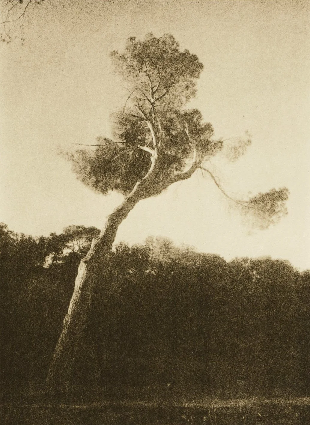
Kodak Bromesko

Agfa Brovira 312
For greater control over contrast (and color), we can vary the ratio of the A and B parts. This way, we can push the midtones toward the highlights or shadows. More part A means more contrast and a more intense color. More part B means less contrast and more subdued colors. Here are a couple of comparisons. On the left, a developed copy with equal parts A and B, and on the right, with more A.
Difference in contrast and tone with more part A, right.
Here more part B in the right photo producing a much flatter image.
Texture creeps up in the sky with more part B.
Embracing the accident
The almost unpredictable nature of lith printing is an open invitation to let loose in the darkroom and see what happens. It's not about printing like crazy (with the price of photographic materials these days), but rather about giving space for things to happen beyond the idea we had in mind at the beginning of the session. That way, every now and then, a kind of magic happens that makes the hours spent in the dark shaking the developer tray, alone and often overthinking everything, worthwhile. As Tim Rudman, the undisputed master of lith, said, "The more you print, the luckier you get." And it's true, too!
Some faulty batches of Fomatone produce the “snowball” effect
Going a little further, we can also look for the accident using those paper packages that are in such poor condition that not even lith developer can save them. Packages that have been in attics and basements for decades, exposed to changes in temperature and humidity, where each sheet produces a different result. I suppose it's the equivalent of using expired film after the fact. As an example, these two images on Ferrania Vega paper which, incidentally, I really like. The first has produced an effect almost like a cloudy sky or perhaps a moonlit scene. The second is Ferrania Vega Chamois. The color is the very base of the paper, and you can see the mold filaments growing on the edges, which in this case adds to the image.
Moody with Ferrania Vega.

Mouldy Ferrania Vega Chamois.
Conclusion.
Lith printing can be as complicated or as simple as any other aspect of photography. You can approach it armed with all the necessary chemical knowledge or, if you're more like me, it's more a matter of reading the basics, understanding very little, and getting on with it. With a bit of luck, in 15 years, you'll have some idea of what you're doing. At a time in 2010 when I felt like my photos weren't going anywhere, I decided to try this process and haven't looked back. Sometimes (often), it can be very frustrating, but on those days when the wee darkroom gods wake up in a good mood, the results, never quite what you expect and often totally unexpected, make you feel like a Master Printer, if only for a few minutes.